Disclaimer: I am relatively new to the world of drawing and sketching. Therefore, the sketches you are about to see are not the best. Besides, the camera on my phone is not very good which results in a lack of quality in the photos of my sketches.
Currently, I am very interested in drawing and sketching. Until now, I mostly did characters and a bit of pixel art. Therefore, when @leon asked whether I wanted to design a favicon for this blog, I saw it as a challenge and the opportunity to learn something new.
To do my sketches I follow the tips, that Josiah “Jazza” Brooks posted a while ago. The first being a step-by-step tutorial for drawing characters, the second a video about sketching tips and tricks. In addition to that, I use tips from the book “Drawing Ideas: A Hand-Drawn Approach for Better Design” by Mark Baskinger and William Bardel (ISBN-13: 978-0385344623).
The first phase of sketching is research. For me, this meant figuring out, what makes a favicon a favicon and getting to know the context, meaning the design of the blog. The biggest constraint is the small size of a favicon. Therefore, not a very high level of detail can be used. This also means that not many colors are available. Usually, favicons consist of a few shapes which are colored in opaque color.
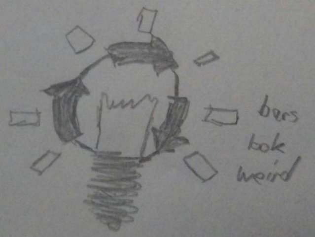
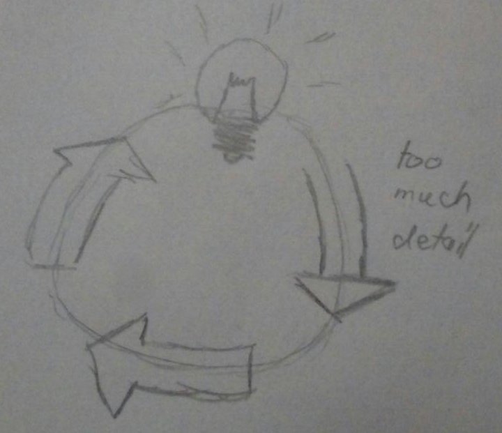
The second phase I do is brainstorming. I write everything down, that comes to my mind. I started with the motto of the blog: “Code, Crash, Learn, Repeat”. To “Code”, I thought of using some code, maybe a 01, an IDE, the matrix, and the color green. “Crash” resulted in the words “lightning”, “car crash”, and “destruction” as well as error icons, and the color red. To “Learn”, I thought of books, light bulbs, brains, pens, and the color yellow. “Repeat” just meant doing something circular to me. These associations may seem obvious, nevertheless, they help to begin the sketching.
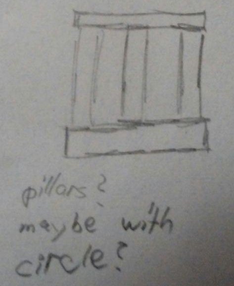
The first sketches were not really elaborate, but only served to see in which direction one could move with the ideas. However, I wasn’t really satisfied with any of the sketches.
After that, I tried to bring some color to the game and so perhaps come up with better ideas. Here I noticed a fundamental problem with my color associations: If I use all colors and arrange them in a circle or triangle, the color scheme resembles the logo of Google Chrome.
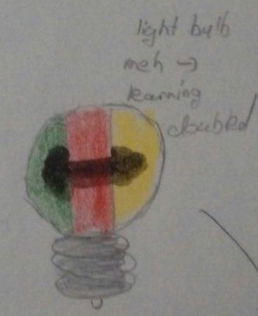
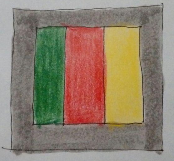

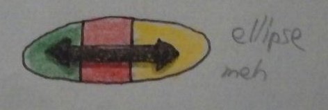
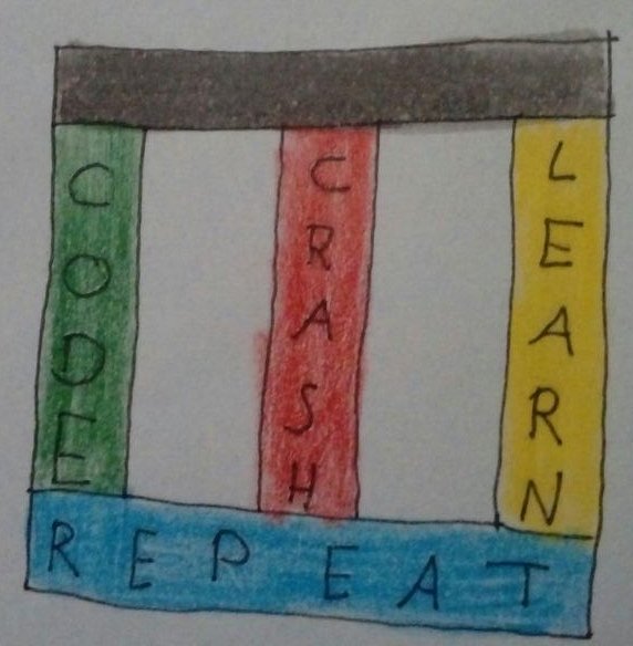
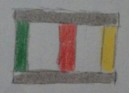
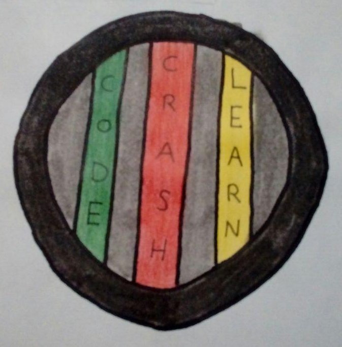
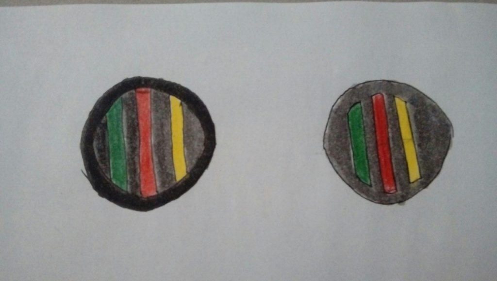
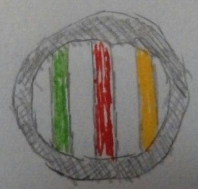
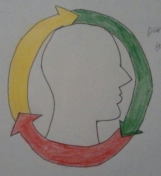

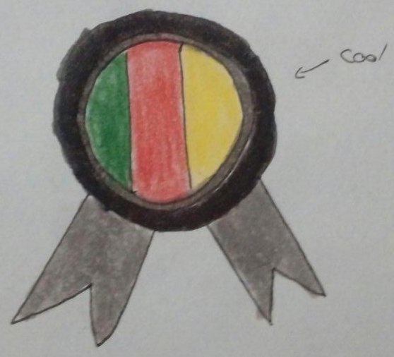
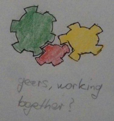
With this problem, I met @leon to talk about my sketches for the first time. We agreed that we need to do something different with the shape. The colors had to stay as we could not find any other that would resemble the ideas that we wanted to convey.
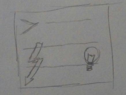
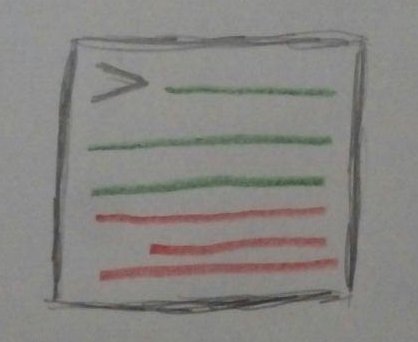
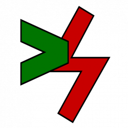
When I drew the icons, representing brash, code and learning, in a rectangle, I realized, that until that point, I only thought of drawing these next to each other. So now, I decided to let them overlap, also to allow to make certain aspects more important than others. That way, the “>”, representing code, is over the lightning, representing crash, as the code is more important that that it crashes. Same with the light bulb for learning.
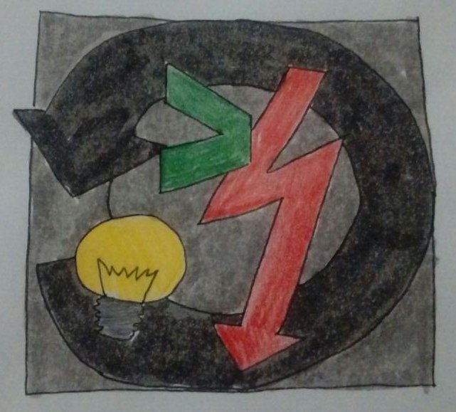
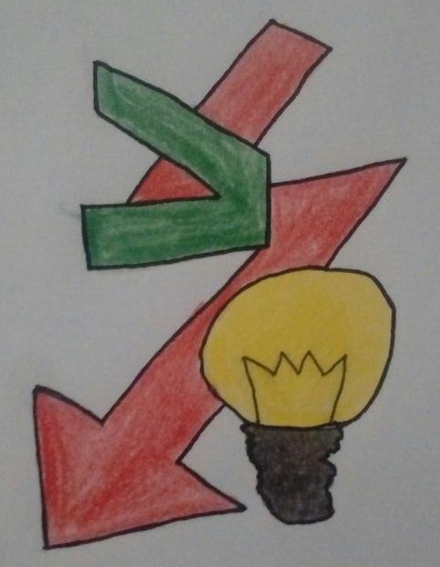
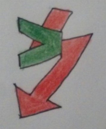


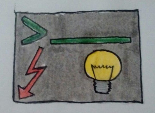
In the second meeting, @leon said, he liked the overlapping symbols and the badge, that I showed him in the first meeting. Thus, I went to create those as SVG graphics, using Inkscape.
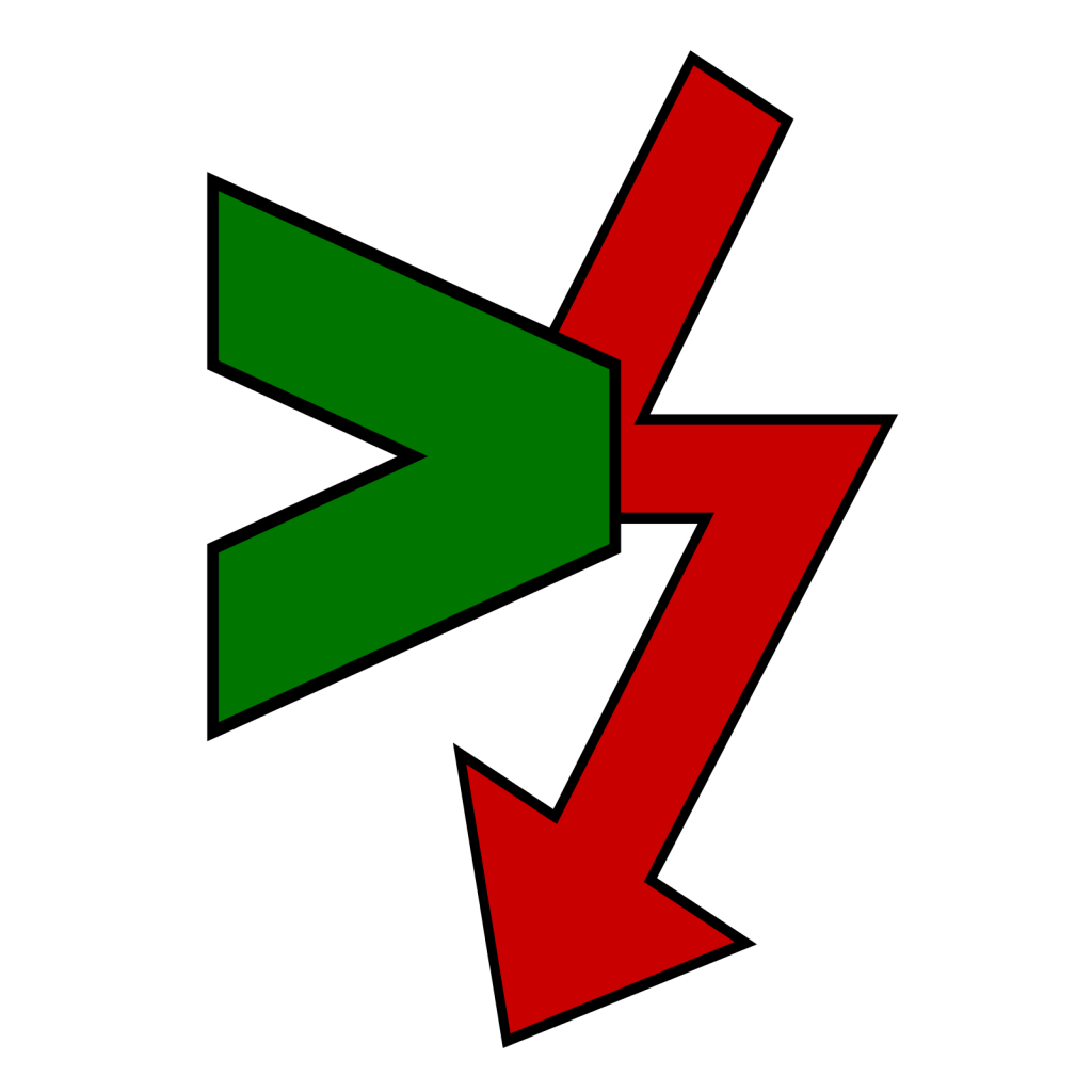
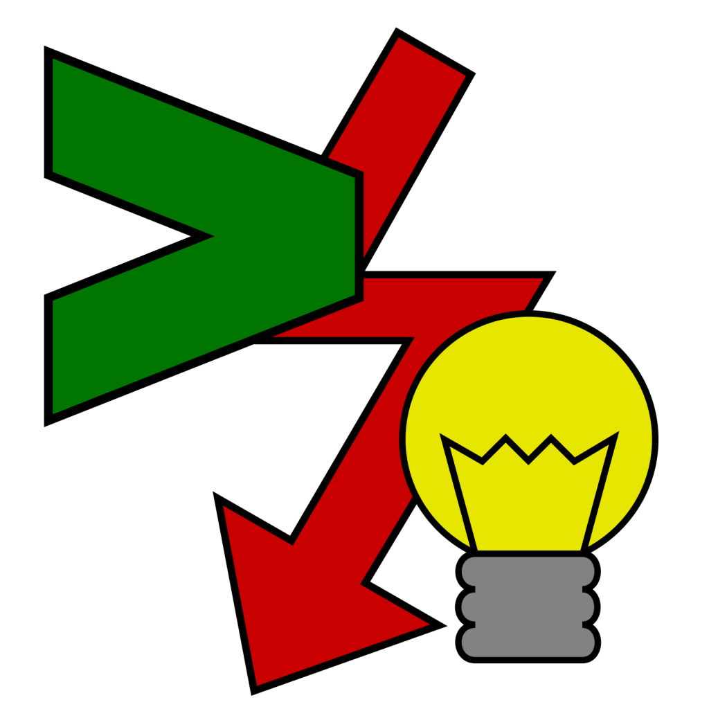
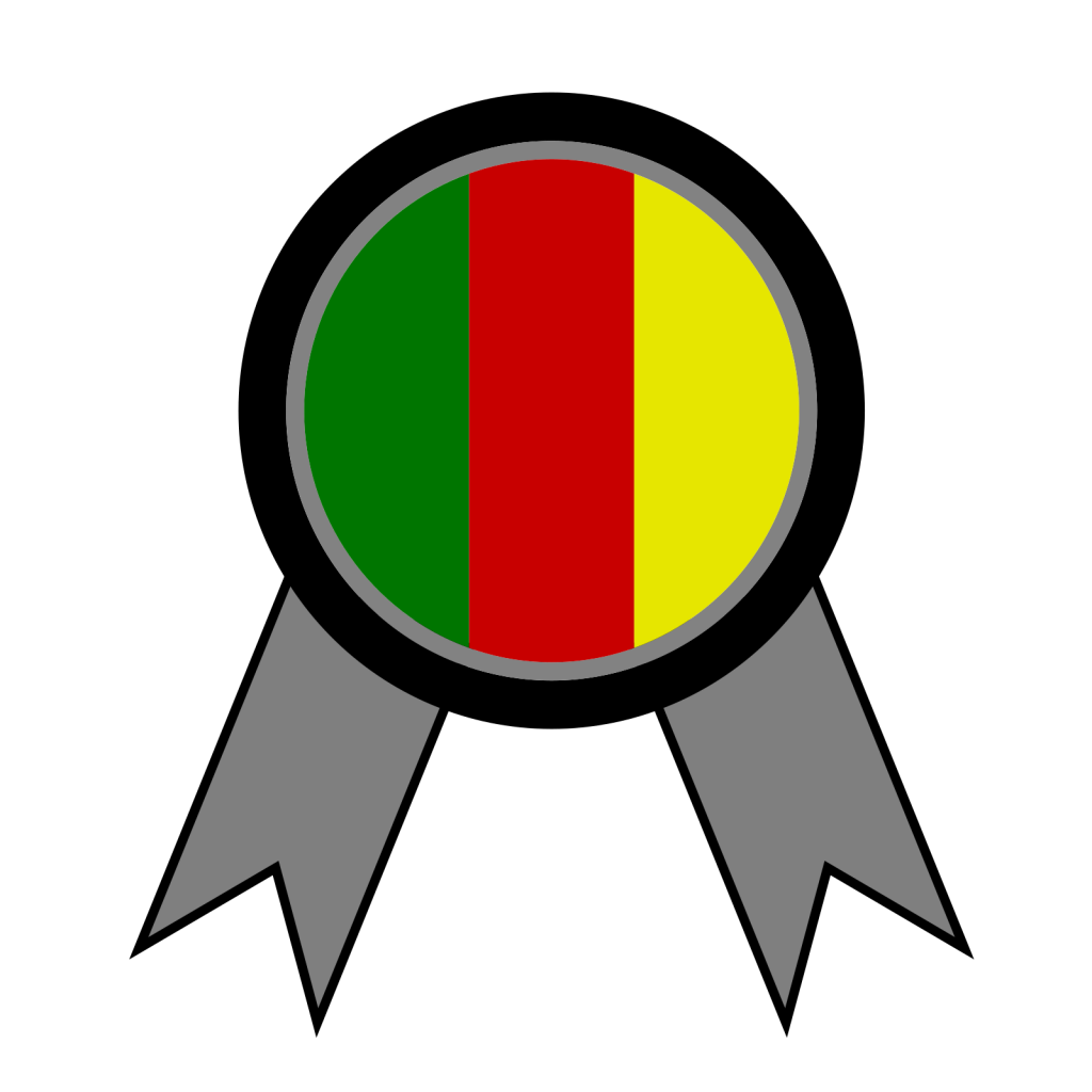
So the above designs are the finalized ones. We currently use only the left one as favicon. The other two currently do not have a use case, but maybe someday they will.
Addendum: @leon asked me whether I could do a version without the arrow tips, so here they are:

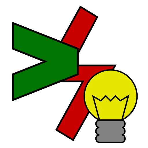
Addendum 2: Now that I am revisiting this, a few months after I actually sketched the favicons, I’m not very happy with them anymore. But as my workload got higher, I have neither the time nor the energy to rework them. They will have to do the job for now.
